GrafEq - The View Buddy Floating Window
 Macintosh Manual
Chapter 6. The View Buddy Floating Window
The view buddy floating window provides tools for interpreting and augmenting
a graph and its views. It appears automatically when a view window is foremost.
Figure 6.1 shows the view buddy window in its initial mode, colour:
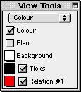
Figure 6.1: The view buddy floating window in its initial mode, colour
The view buddy has seven different modes.
Colour mode is the initial mode, and is shown in figure 6.1 earlier.
The other modes are accessable by clicking on the mode pop-up menu,
and then selecting a new mode from the menu that pops up.
The mode pop-up menu is at the very top of the view buddy floating window.
View buddy modes include:
- information mode,
- colour mode,
- ticks mode,
- zoom mode,
- draw mode,
- one point mode, and
- two point mode.
Before going into details about the different modes of the view buddy, following are
some hints and general instructions about the floating window and its modes:
- The view buddy floating window appears only when a view window is foremost.
It is otherwise hidden, but returns when a view window is activated.
- Options in the information, ticks, draw, one point, and two point modes
apply only to the one view window directly associated with the view buddy.
Options in the colour and zoom mode apply to all view windows of the associated graph.
- Following are some general instructions:
- Selecting an option’s checkbox activates the option;
clicking on a checkbox or its name toggles between its
selected and unselected states;
- Clicking on a pop-up menu opens the pop-up menu,
so the desired option can be selected from it.
- The colour mode is the initial mode since its options are
useful for optimizing the clarity and readability of graph views.
Information Buddy
The information buddy displays advanced, technical data about the graphing process.
It is accessed by selecting “information” from the buddy mode pop-up menu at
the top of the floating window.
Figure 6.2 shows the information buddy displaying data for the graph view as a whole:
Figure 6.2: The information buddy displaying data for the graph view as a whole
The information buddy has several different sub-modes. “Totals” sub-mode is the default,
as seen in figure 6.2 earlier. It displays data for the graph as a whole.
Other modes display data for an individual relation of the graph.
Each mode is accessed using the sub-mode pop-up menu,
which is just below the mode pop-up menu at the top of the view buddy floating window
All information displayed applies to the immediately associated
graph view only. The data elements, from top to bottom, are
explained as follows:
- Number of regions
- This element shows the number of rectangular blocks remaining to be refined by GrafEq.
When plotting is completed, the number of regions will be zero.
- Memory allocated
- This element shows the RAM being used by the graph.
It varies with the complexity of the graph and the plotting technique employed.
When plotting is completed, it shows the RAM required for
displaying the plotted graph in the view window.
- Scheduling pedigree
- This element shows the plotting technique currently being used by GrafEq.
Plotting techniques include the following:
- Dynamic: GrafEq is refining along the perimeter of the graph.
This is the fastest technique, but requires the most memory.
- Perimeter scanning: GrafEq is refining along the perimeter of the
graph. This is the second fastest plotting technique.
- Area scanning: GrafEq is refining everywhere inside the graph. This
is the slowest plotting technique, and requires the least memory.
- Static: GrafEq is refining either by perimeter or area scanning.
- None: GrafEq has not refining the graph.
- Evaluation speed
- This element shows the up-to-the-moment average rate of graph processing.
It varies with the complexity of the graph relations,
processor speed, and memory resources.
Evaluation speed is measured in
Equation Evaluations Per Second (EEPS), Kilo EEPS (KEEPS), or Mega EEPS (MEEPS).
When graphing is completed, this rate will be removed from the display.
- Total number of evaluations
- This element shows the total number of evaluations performed by
the graphing process. It varies with the complexity of the graph view.
The number of evaluations is measured in
Equation Evaluations (EE), Kilo EE (KEE), or Mega EE (MEE).
When graphing is completed, this number will stop changing.
- CPU time/total time
- This element shows the time spent on graph plotting.
CPU time measures the amount of time the CPU has spent on graphing
after factoring out the time spent on other tasks.
Total time measures the total amount of time that has elapsed since
graphing started. Any time that elapsed while the graphing process
was deactivated (by deselecting the Graph (...) checkbox)
is not included in the total time (or in the CPU time).
| Tip: | If CPU time is small relative to total time, closing non-essential
windows and/or quitting other programs will increase graphing
speed, as GrafEq will be able to use more CPU time for graphing. |
|
- Dimensionality
- This element shows the dimension refining is occuring in. Even through
GrafEq presents graphs using two dimensional views, GrafEq may be
processing relations in higher dimensions if relations include
variables other than the axes variables.
- View size
- This element is available only in the “totals” sub-mode. It shows the view region’s
width and height, in pixels.
- Show Work checkbox and colour pop-up menus
- These elements are not available in the “totals” sub-mode:
they are for showing detailed plotting information for a relation.
When Show Work is selected, several colours will be used to
convey graphing information, instead of the usual two, as follows:
- pixels that are proven to contain solutions have the appropriate relation’s colour;
- pixels that are proven to not contain solutions have the background’s colour; and
- pixels not yet proven to contain, or not to contain, solutions, have the work area colour.
Two colour pop-up menus are provided for the work area.
If the colours selected are different,
work areas will flash between the two selected colours.
If they are the same, work areas will appear in the one colour,
and will not flash. Different colours are useful when using a black-and-white display.
- Background colour pop-up menu
- This pop-up menu is for conveniently changing
the colour used for the graph’s background. It might be useful for making work areas stand out.
| Hint: | The Background colour pop-up menu is also in the colour buddy (which
is explained in the next section). The two Background pop-up menus are
synchronized. |
|
The contents of the information view buddy can be customized using the preferences.
For details, refer to the Preferences chapter.
Colour Buddy
The colour buddy is for changing the appearance of graph views.
It is accessed by selecting “colour” from the buddy mode pop-up menu at
the top of the floating window.
Figure 6.3 shows the colour mode view buddy:
Figure 6.3: The colour buddy
All colour view buddy options apply to all view windows of the associated graph.
The elements, from top to bottom in the colour buddy, are explained as follows:
- Colour checkbox
- The Colour checkbox is for toggling between a colour view and
a black-and-white view. The black and white option is useful for
printing to a black-and-white printer.
- Blend checkbox
- The Blend checkbox is for toggling between a blended graph and a layered graph.
Blending is useful for showing intersecting areas
when graphing multiple regions, such as those given by inequalities.
A layered graph initially displays relations in the order that their respective relation windows
are opened, earliest at the bottom, latest at the front.
The layers can be reordered by hiding and showing relations. Click
on a relation’s checkbox to hide and show that relation.
- Background colour pop-up menu
- The Background colour pop-up menu is for changing
the colour used for the graph’s background.
For black-and-white graphs, the background colour can be either solid black or solid white.
- Ticks pop-up menu and checkbox
- The Ticks colour pop-up menu is for changing the colour used for the ticks.
For black-and-white graphs, the ticks can be either black or white.
The Ticks checkbox is for showing and hiding the ticks.
- (optional) Custom ticks colour pop-up menus and checkboxes
- Each custom ticks pop-up menu and checkbox is similar to the Ticks
pop-up menu and checkbox, but control display options for custom ticks instead of ticks.
| Hint: | Custom ticks colour pop-up menus are synchronized with the pop-up menus in the
custom ticks windows. |
|
- (one or more) Relation colour pop-up menus and checkboxes
- Relation colour pop-up menus are for changing
the colours used to display relations.
For black-and-white graphs, patterns are chosen instead of colours; a pattern pop-up
menu is available instead of a colour pop-up menu.
| Hint: | Relation colour (or pattern) pop-up menus are synchronized with the
Colour (or Pattern) pop-up menus
in algebraic and structural relation windows. |
|
The checkboxes adjacent to the colour pop-up menus are for
showing and hiding relations.
Ticks Buddy
The ticks buddy is for showing or hiding the ticks, selecting optional
tick components, and customizing the appearance of the ticks. It is accessed by
selecting “ticks” from the buddy mode pop-up menu at the top part of the floating window.
Figure 6.4 shows the ticks mode view buddy presenting the preconfigured ticks options:
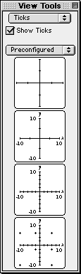
Figure 6.4: The ticks buddy presenting the preconfigured ticks
All options apply to the current view only.
The Show Ticks checkbox is the first option offered in the ticks buddy: it is just
below the mode pop-up menu. When the checkbox is selected, ticks are shown.
| Hint: | By default preference settings, ticks are shown automatically when new views are opened.
If GrafEq doesn't show ticks, graphing of
complex relations might be faster. For details about changing preference settings, refer
to the Preferences chapter. |
|
The ticks buddy provides four different ticks sub-modes. “Preconfigured” is the default sub-mode,
as seen in figure 6.4 earlier. Other sub-modes include “marks”, “outline”,
and “parameters”.
Each sub-mode is accessed using the pop-up menu below the Show Ticks checkbox.
The ticks sub-modes are explained as follows:
- Preconfigured
- The “preconfigured” sub-mode provides basic (simplified) tick options using
four buttons. Each button sets the ticks to a preconfigured setting, as follows:
- button 1: axes and sparse ticks;
- button 2: axes, sparse ticks, axes labels, and bounds;
- button 3: axes, dense ticks, axes labels, and bounds;
- button 4: axes, dense ticks, axes labels, and bounds, and grid cross ticks.
| Tip: | This option can be used for making graph paper. |
|
|
Figure 6.5: The “preconfigured” sub-mode of the ticks buddy
|
- Marks, outline, and parameters
- “Marks”, “outline”, and “parameters” sub-modes are for fine control of
the appearance of the tick’s components. Option are offered using expandable lists.
- Collapsed lists can be expanded by clicking on the list’s title, or on the adjacent
triangular arrow.
- Expanded lists reveal their elements, some of which may be expandable sub-lists.
Revealed list elements can then be selected individually; expandable sub-lists can
then be further expanded.
- Each list has a checkbox; all list items can be conveniently selected or
deselected using this checkbox.
A list which has elements that are selected as well as elements that
are not selected displays a horizontal bar in its checkbox.
- Expanded lists can be collapsed by clicking on the list’s title, or on the adjacent
triangular arrow.
- Marks
- This sub-mode is for selecting which tick components are shown. The various marks are useful
for interpreting the graph, and for augmenting its display. Figure 6.6 shows all of the options:
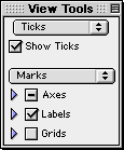
Figure 6.6: The “marks” sub-mode of the ticks buddy
- Outline
- This sub-mode is for setting the thickness of the optional outline around
tick components. A small area (an outline) may be placed around tick components,
which can imporve readability, especially in cluttered graphs.
Figure 6.7 shows the “outline” sub-mode:
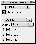
Figure 6.7: The “outline” sub-mode of the ticks buddy
- Parameters
- This sub-mode is for changing the font size used for tick labels and
the density of tick marks used.
Figure 6.8 shows the “parameters” sub-mode:
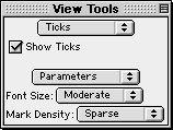
Figure 6.8: The “parameters“ sub-mode of the ticks buddy
- Font Size pop-up menu is for changing the font size for any displayed variables and
bound labels included in the ticks. The presence, or absence, of elements
is governed by the “marks” sub-mode.
- Mark Density pop-up menu is for changing the density of ticks, dots, and
crosses. The presence, or absence, of elements
is governed by the “marks” sub-mode.
Zoom Buddy
The zoom buddy is for zooming in and out of a graph. It is accessed by
selecting “zoom” from the buddy mode pop-up menu at the top part of the floating window.
Figure 6.9 shows a typical zoom mode view buddy:
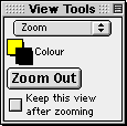
Figure 6.9: A typical zoom buddy
All zoom buddy settings are shared between all view windows.
The controls, from top to bottom in the zoom buddy, are explained as follows:
- Colour pop-up menus
- There is a pair of colour pop-up menus: the one on the upper left is for changing
the colour used for the inside the zoom box; the one on the lower right is for changing the colour
of used for the outline of the zoom box.
- Zoom Out button
- The Zoom Out button is for zooming out from the current graph view.
The new view will have the same center, but both the domain and the range will
be doubled; the new view will cover four times the area of the original view.
- Keep Current View checkbox
- The Keep Current View checkbox is for specifying whether
the current view is kept or discarded after a new view is created by zooming in or out.
Keeping the original view lets you compare graph views before and after zooming.
Discarding the original view saves memory and keeps the machines’s desktop clean and tidy.
- Zoom-in box
- The zoom-in box specifies the scope of the new view that GrafEq will zoom into.
It appears automatically when the mouse is within the graph view region.
Zooming in is done by clicking the mouse, or by pressing the return key,
while the area of interest is within the zoom-in box.
The size of the zoom-in box, and thus the scope it specifies, can be changed
by using the arrow keys: the left arrow narrows it, while the right arrow widens it;
the up arrow heightens it, while the down arrow shortens it.
| Hint: | The mouse is usually at the center of the zoom-in box. When the mouse is still
within the view region but far out towards one side, the zoom-in box stays within the
current view region by sticking to an edge.
As mentioned earlier, the colours of the zoom-in box are controlled by
the colour pop-up menus at the top part of the zoom buddy. |
|
| Tip: | If the desired graph region is not shown in a current view because of
inappropriate view bounds, or because of zooming in, they
can be recovered by zooming out until the desired region is again within the view scope.
Specific regions may then be examined by zooming back in. |
|
Draw Buddy
The draw buddy is for accessing drawing tools which are useful for augmenting the
display of graph views.
It is accessed by selecting “draw” from the buddy mode pop-up menu on the
top part of the floating window.
Figure 6.10 shows a typical draw mode view buddy:
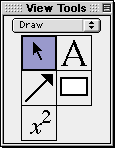
Figure 6.10: A typical draw buddy
All drawings appear on the draw buddy’s immediately associated view only.
The draw buddy provides access to a selection tool, an arrow tool, a box tool,
a text tool, and a formula tool.
Each draw tool is accessed by clicking on a button in the draw buddy window,
and presents its options and controls using a separate floating window.
If an object is currently selected, a tool’s controls will modify that
object; otherwise, the controls will modify the default settings for that
tool, which affect all objects subsequently created.
Draw tools provide elaborate support for augmenting graph views.
Details are available in Appendix III.
One Point Buddy
The one point buddy displays the coordinates of the point the cursor is currently over.
It also provides a magnified view of the area around the point.
The one point buddy is accessed by selecting “one point” from the buddy mode pop-up menu
at the top part of the floating window.
Figure 6.11 shows the one point buddy:
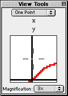
Figure 6.11: The one point buddy
One point buddy controls apply to its immediately associated view only.
The buddy elements are explained as follows:
- Coordinates field
- The coordinates field displays the domain and range coordinates of the cursor point
if the mouse cursor is within the graph view region. Coordinates values are given
with error corrections.
- Magnified view box
- The magnified view box displays a magnified view of the region around the cursor.
- Magnification pop-up menu
- The Magnification pop-up menu is for changing the magnifying factor for the
magnified view box. Supported magnification ranges from half-time(1/2x) to
five-times(5x).
| Hint: | From within the one-point buddy, curve riding is possible by holding down the
shift key while moving the mouse. |
|
Two Point Buddy
The two point buddy displays the coordinates of two selected points A and B,
and attributes of the line formed from joining A and B.
The buddy is accessed by selecting “two point” from the buddy mode pop-up menu
at the top part of the floating window. The two points, A and B, can be
relocated, one at a time, by clicking on them, then dragging them to new locations.
Figure 6.12 shows the two point mode view buddy:
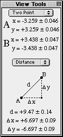
Figure 6.12: The two point buddy
Two point buddy controls apply to its immediately associated view only.
Two point buddy elements are explained as follows:
- Coordinates field
- The coordinates field displays the domain and range coordinates of A and B.
Coordinates values are given with error corrections.
- Attribute pop-up menu and attribute data field
- The attribute pop-up menu is for changing the data type displayed in
the attribute data field. Attribute options are listed and described as follows:
- trig - cosine, Dx, and sine, Dy of the line AB.
- slope - asymptote, h, and slope, m of the line AB.
- distance - distance, Dx, and Dy between A and B.
- degrees - angle formed by the line AB and a horizontal line through A, in degrees.
- radians - angle formed by the line AB and a horizontal line through A, in radians.
All attribute data are given with error corrections.